With this month's Omakase game, I wanted to take a super simple game idea, and working on polishing the feel of the core mechanic -- not necessarily the mechanic itself, but how satisfying it is to the player.
I was also traveling for a good half of the month, so I put a few constraints on myself to not go overboard:
- I will write the movement mechanics from scratch.
- I will not focus on level design.
- I will focus on creating an aesthetic and learning techniques to make things feel good.
Eventually, I decided on a super quick arcade-style scenario, where you control a little tadpole in a big pond. You can swim around, and cast a small magic attack.
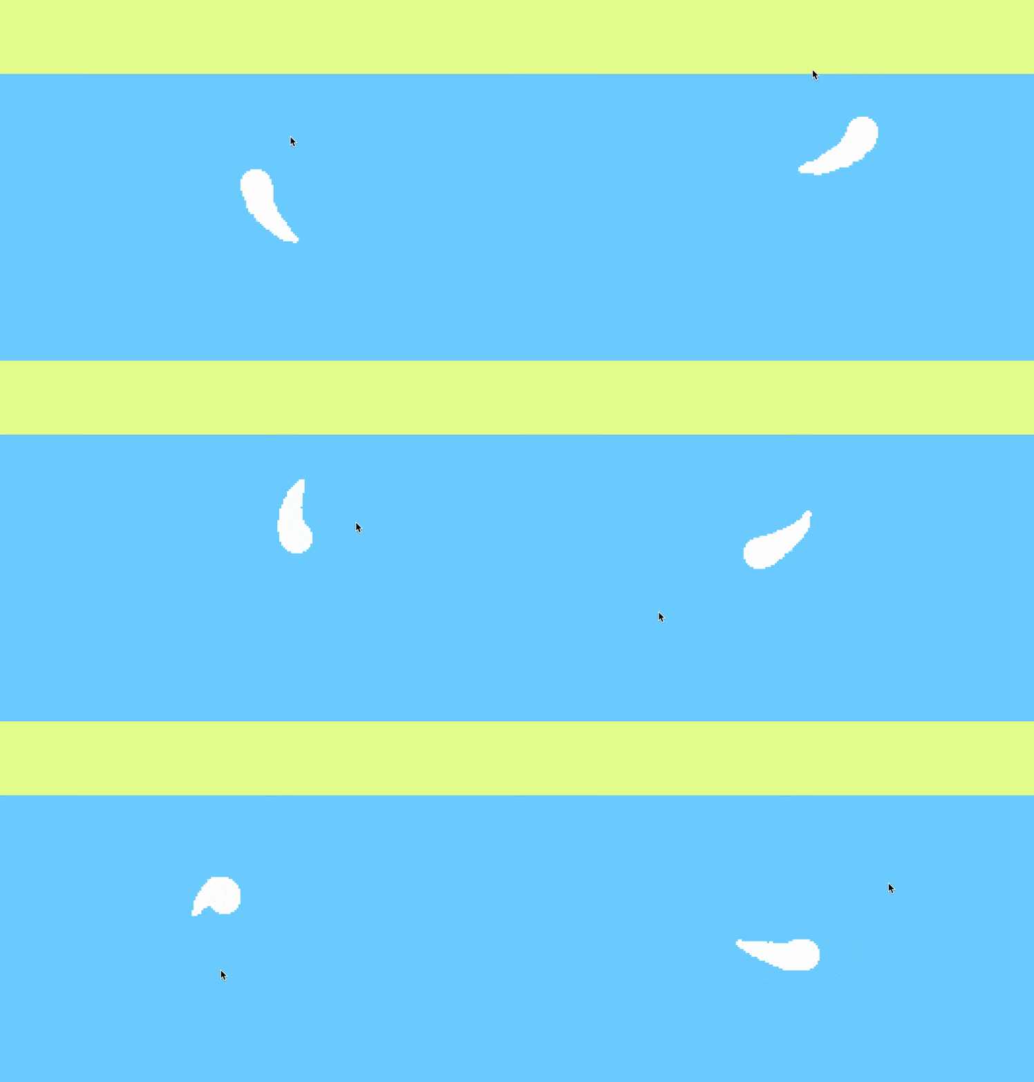
In this first iteration, I decided to test out an aesthetic I had been considering for a while -- build a scene entirely out of geometric shapes, but render it onto a pixel-art canvas.
The tadpole you see is actually a row of circles, each smaller than the last, connected by a physics rope. When seen together with the pixel-art renderer, they connect and form the shape of a tail!
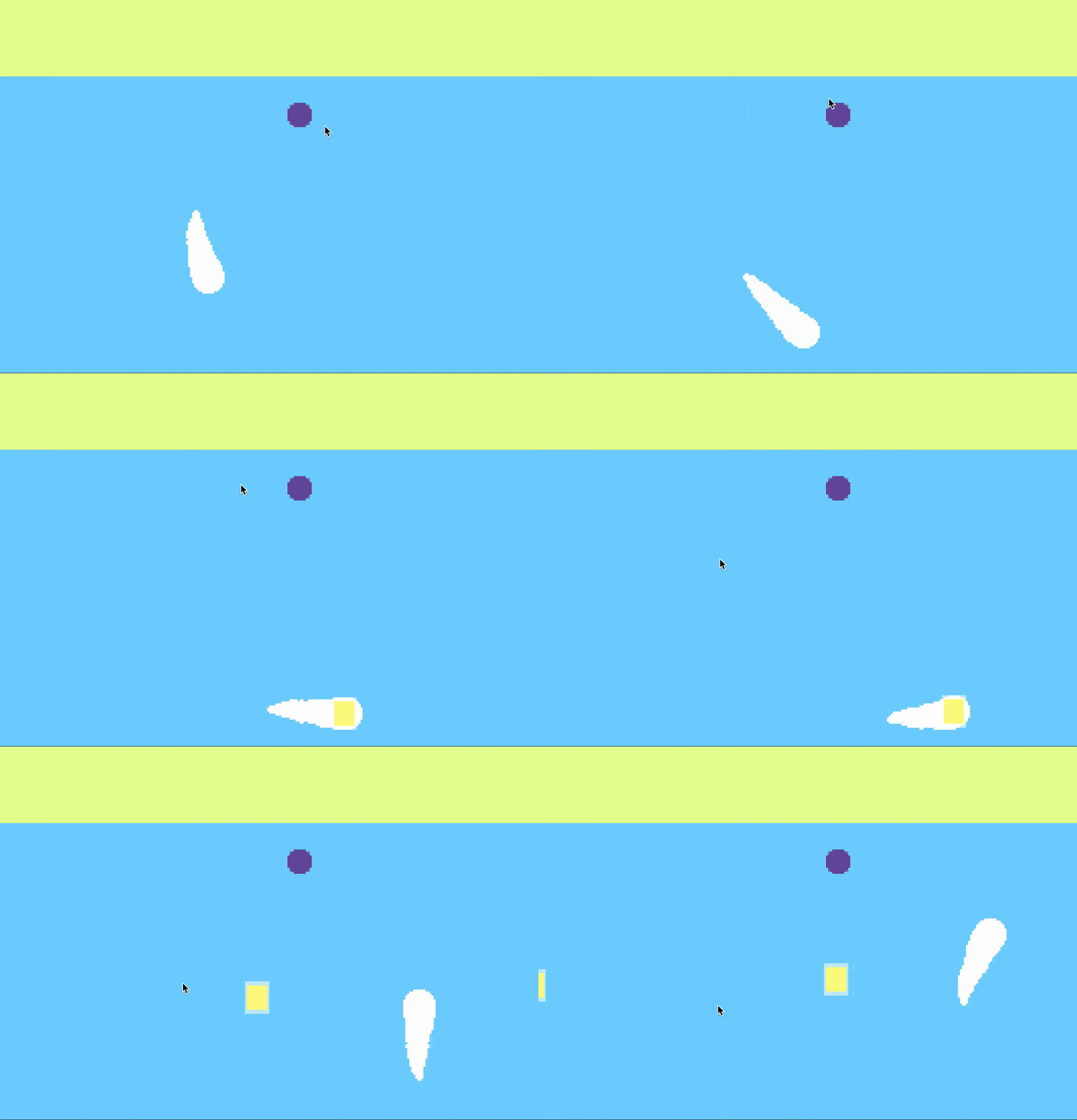
Next, I wrote a quick bullet shooting behavior. This would end up being the core mechanic that I would polish up and make satisfying. As of now, however, the tadpole just launches a square towards the mouse.
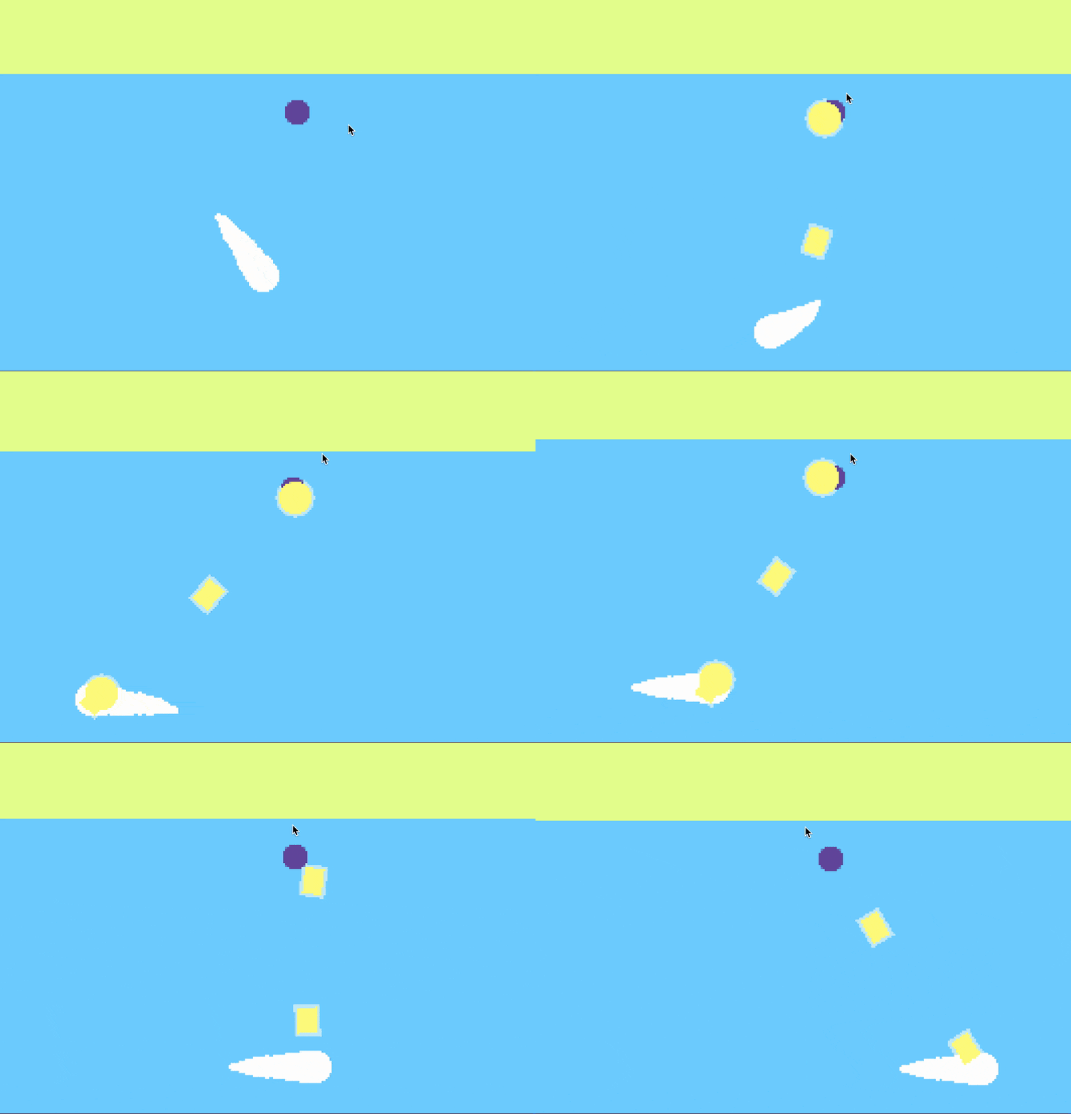
The first starts of adding 'juiciness'! When the bullets hit an enemy, they now disappear and shake the screen a bit. There is also a quick shoot and hit animation where I show a yellow circle.
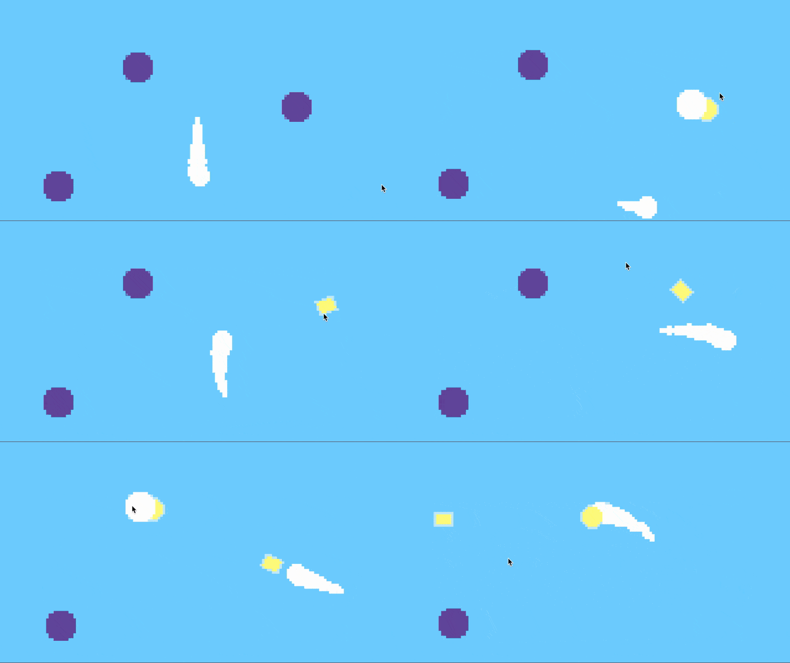
In the next iteration, I decided to all-in on the pixel feel, and I set the render solution to a tiny 160x90. Enemies can now flash white when hit, and blow up in a little red circle when they're killed.
The game is starting to feel fun to play now! I'm already starting to fall into the trap where I just keep playing the build without actually making any changes. But I manage to break free, and here I introduce a dynamic camera and some particles when shooting.
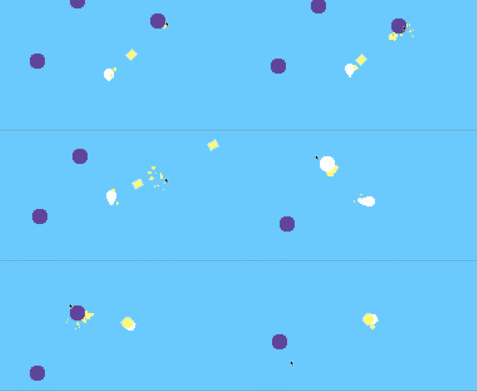
Keeping with the particle theme, I add a few yellow splashes when the bullet collides with an enemy.
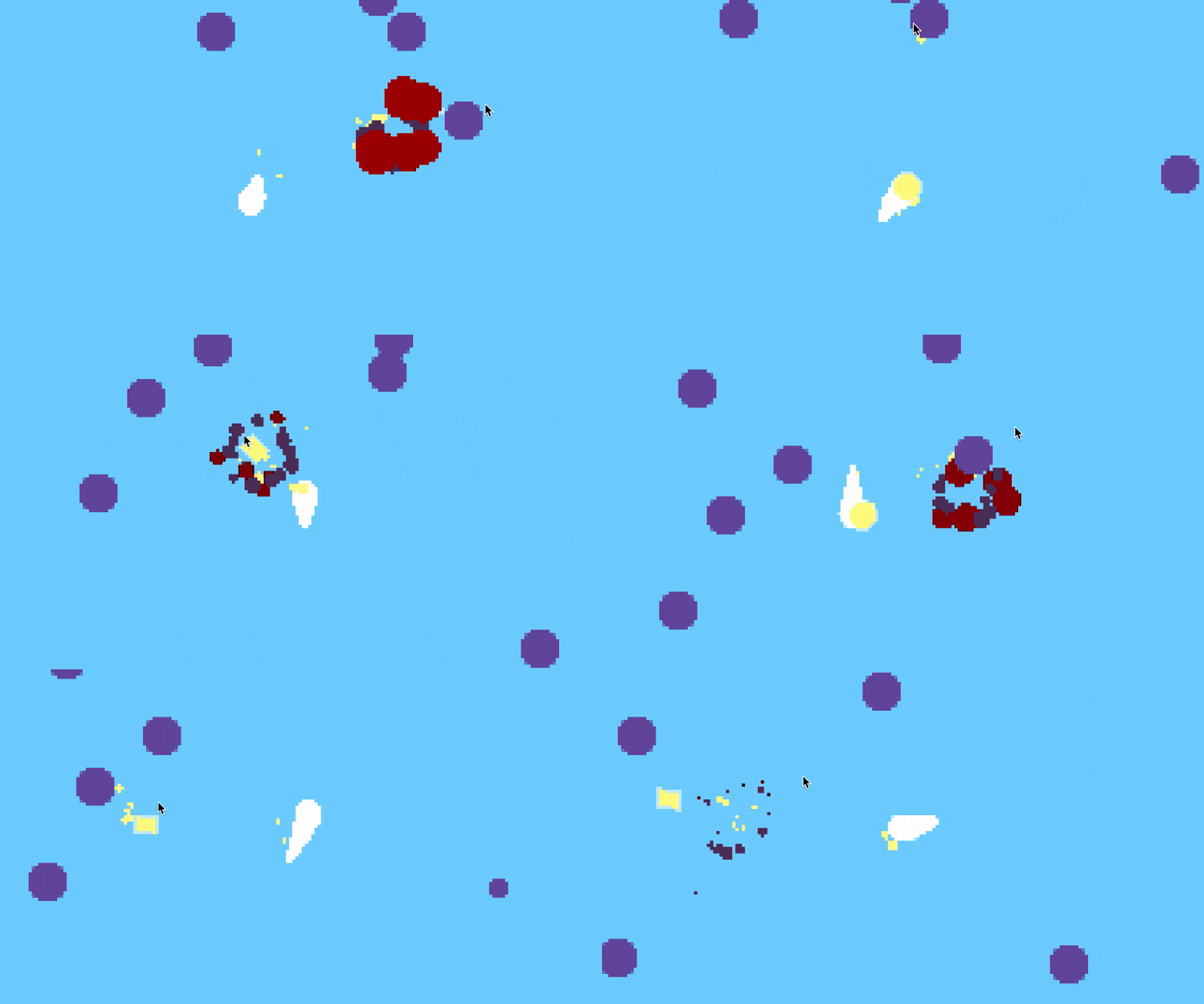
And here we have the last bit of particle effects! Gone is the dinky little red circle -- when an enemy dies, they now explode into a flames and smoke.
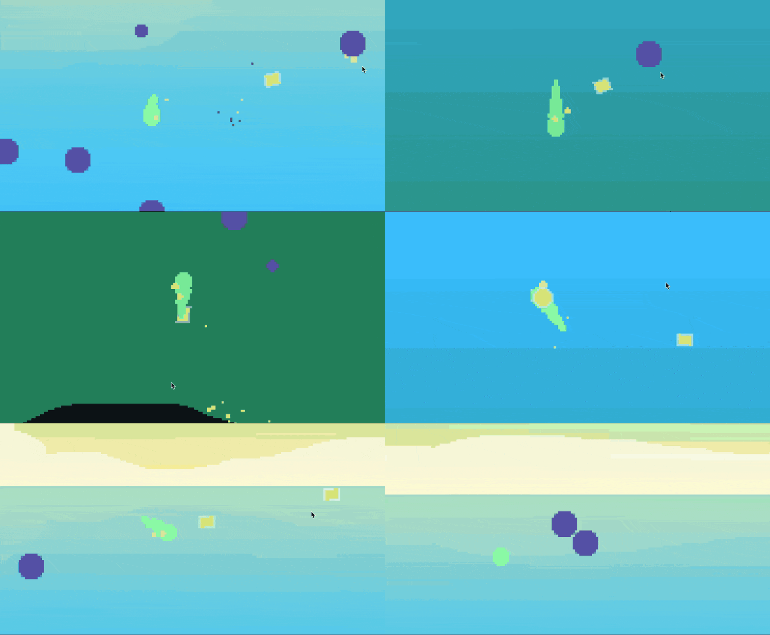
Finally, to wrap up this little project, I gave a better color scheme to the player, and turned the background into a blue-green gradient to emphasize the water feel. I added in a solid ground, and a water surface where the player can jump out of.
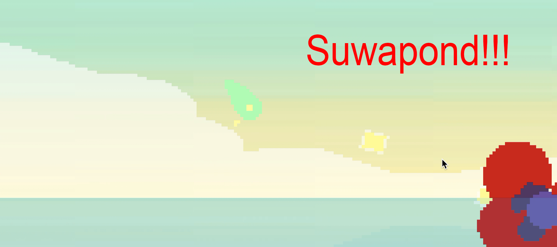
And with that, the second Omakase is over! This month's was definitely a short one, due to my limited free time, but it was still a nice excersize in diving into how a few particles and screen shakes can make things so much more satisfying.
As always, grab the game here! Move with WASD and shoot with the mouse. I recommend playing in a small window rather than fullscreen.